THE BRAND

Driven by the question of “who could you be if you had nothing standing in your way?” the keystone of our business centred on answering this question for the people who would come to work with us.
Guided by our compass word “VASTNESS” we sought to create a sense of limitlessness on every level of our business. From the aesthetic, to the ambience, to the branding, to the ethos, to the people, to the community events, and beyond. On every level our goal was to create broad, blank, space to be and create anything imaginable.
The name was an easy progression of those values: BLANC SPACE.
[At this point you might be wondering whether we can actually spell, or whether we have a penchant for those crisp white varietals in the Marlborough region of South Island NZ. Stay with us!]
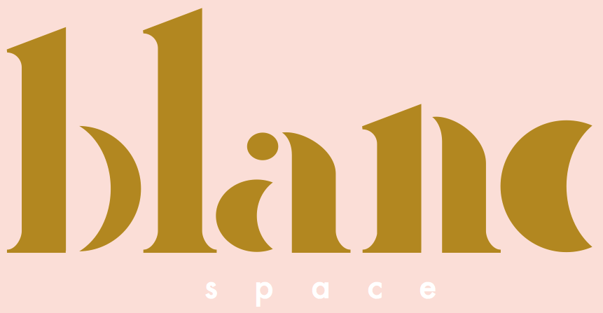
So even though we went with the soft balance of the “C”, in “BLANC”, we actually pronounce it “BLANK” (side note: rose (Hayley) malbec (Mick). We saw the “C” as a crescent moon, and since “SPACE” was an inception of the tangibility of the business itself, with literally the vastest thing we could imagine, the poetic licence and visual balance superseded the spelling.
With our values drilled down upon. The next call was to the one and only, JAY DONALD WOODS.
He’s the end of the road in graphic design. The Amsterdam-based (at the time- he’s just touched back down in oz!)-South-African-Aussie designer’s creative eye for meaning and detail, bows to NONE. We’ve worked with Jay more times than we can count over the years to deliver our most precious visual concepts, and he consistently raises the bar every time (but don’t just take our word for it, Nike, Versace, Hurley, Air New Zealand, and Splendour In The Grass have him on speed dial too!).
When we told him our compass word for BLANC SPACE was “vastness” and that the moon was closest to our aspiring hearts, he delivered this logo and typeface. It was like he took a trip to the very depths of our soul, snapped a Polaroid, and brought it back (if you look closely, you’ll see every phase of the moon in our logo). Imbued with hidden meaning, his branding is slick, profound, multi-tiered, and stunningly unique (which is why his work is imitated time and time again).
With our branding born, we could now confidently approach our DESIGN…